9toThrive — Visual Identity
The Starting Point
Another co-working space in Hyderabad.
Another brief that could’ve easily become another safe, predictable brand.
But that’s exactly what we wanted to avoid.
The Shift
Everyone in this category talks about working better.
But the people actually using these spaces? They’re trying to grow faster.
That’s where the idea clicked.
What if we moved away from “9 to 5” altogether?
The Result
9toThrive
Not a tweak. A switch.
From putting in hours to getting somewhere.
It keeps the familiarity of “9 to 5″ and completely changes the outcome.
Same phrase. New purpose.
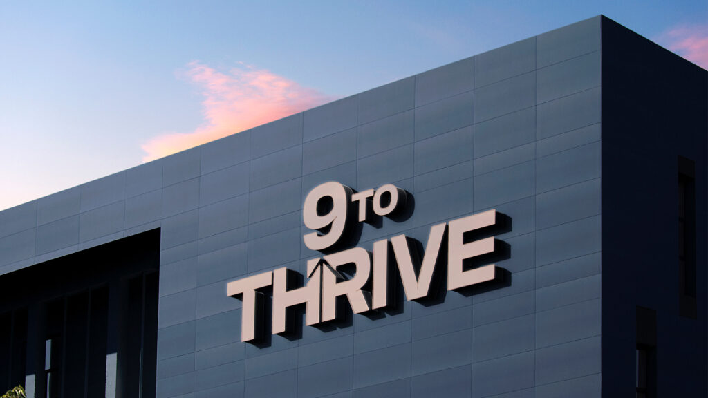
Designing the Mark
We built the idea into the mark — not around it.
An upward arrow is seamlessly carved into Thrive — rising from within the word, not sitting beside it. It signals growth and direction without breaking the flow.
Bold, structured, and cut with intent. The typeface is sharp and controlled, giving the wordmark a strong presence.
While the Midnight Navy Blue grounds the brand in trust and stability, the Warm Taupe offsets it – adding softness, balance, and a more human edge.
Everything is doing one job: making progress feel built-in.
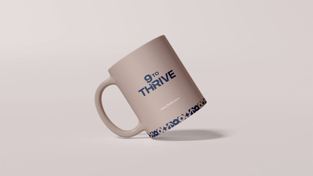
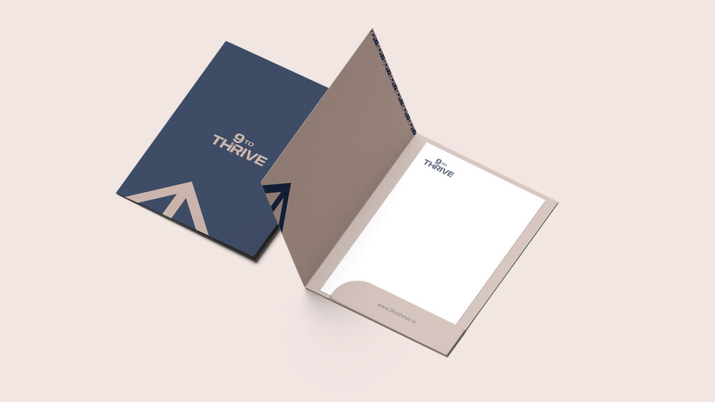
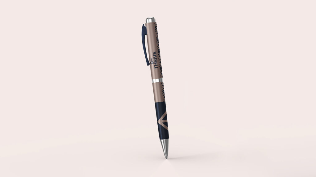
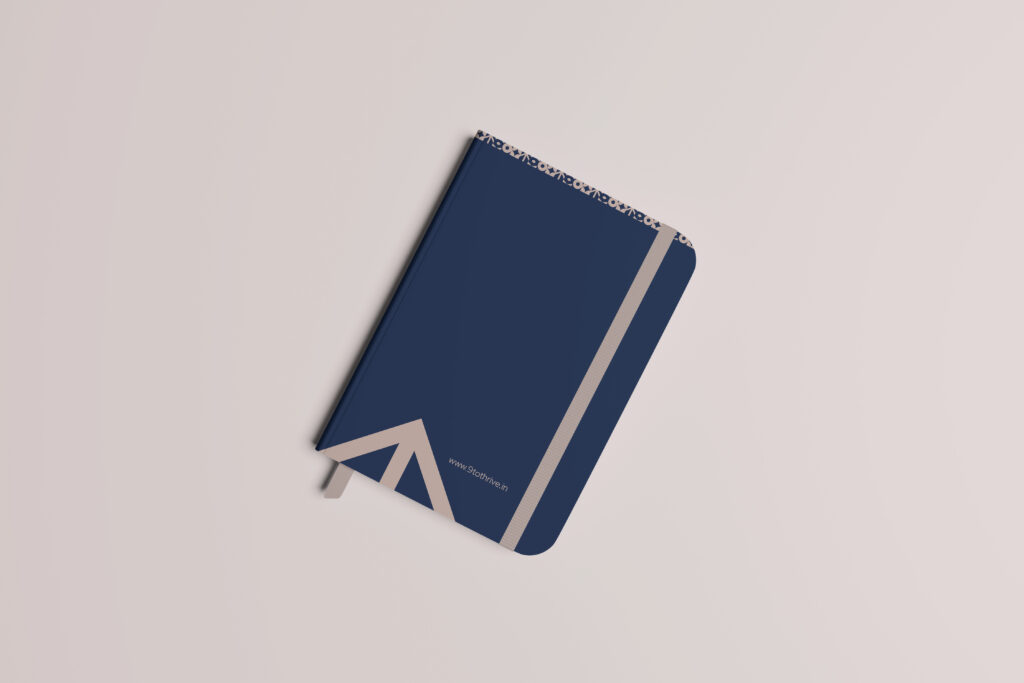
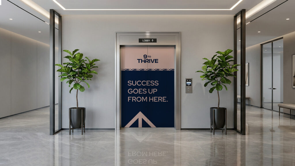
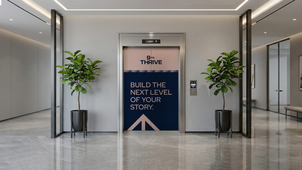
What We Built
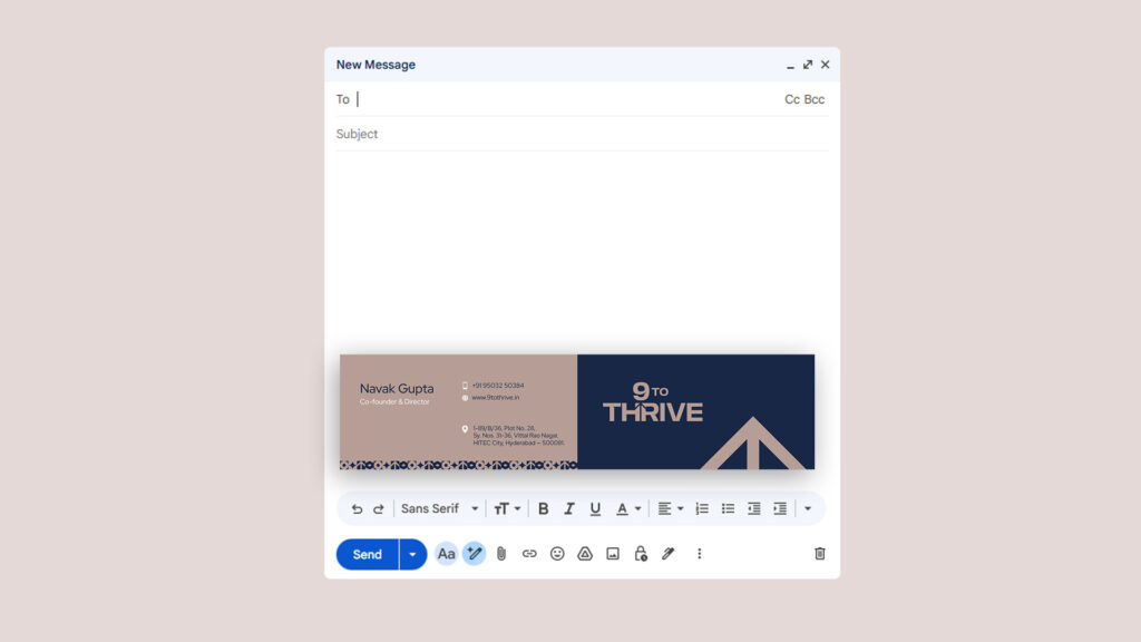
We took the identity and rolled it out across the key touchpoints.
Core branding, a clean website, and high-visibility lift branding within the space.
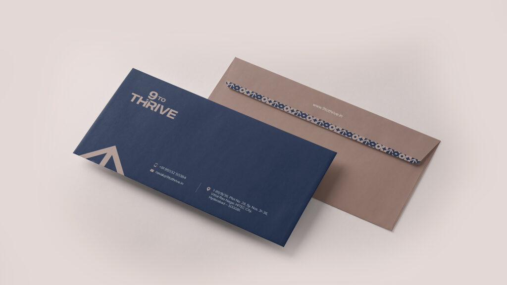
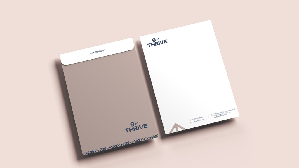
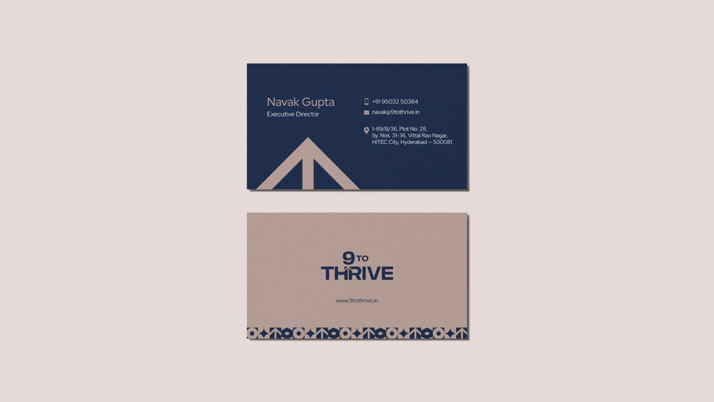
Stationery kept it all consistent — clear and on-brand.
Where It Lands
9toThrive doesn’t just name the space. It sets the expectation.
This isn’t where you come to sit and work.
It’s where you come to move forward.