Dhi School of Excellence — Visual Identity
The Starting Point
Dhi was built from scratch, starting with the name.
The goal was to create a school brand that could balance two things clearly: international standards and Indian values.
Naming & Idea
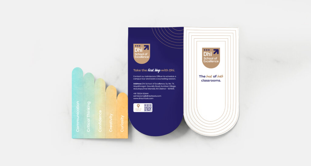
We chose Dhi — from Sanskrit, meaning ‘intellect’, ‘wisdom’, and ‘perception’. It gave the school a rooted, meaningful foundation while still feeling modern.
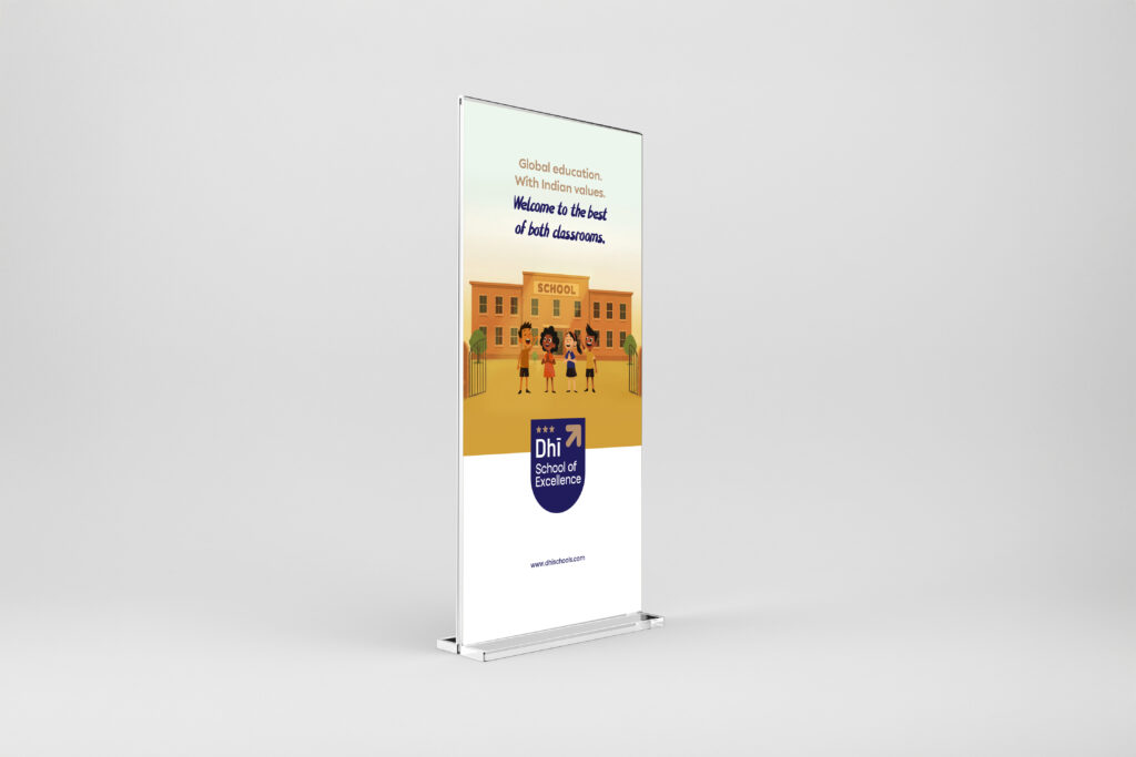
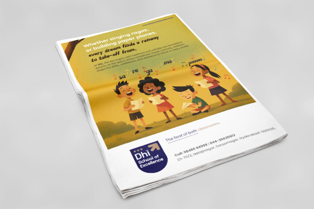
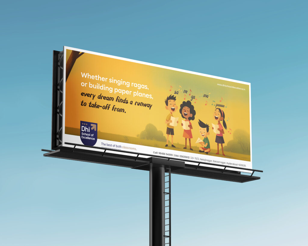
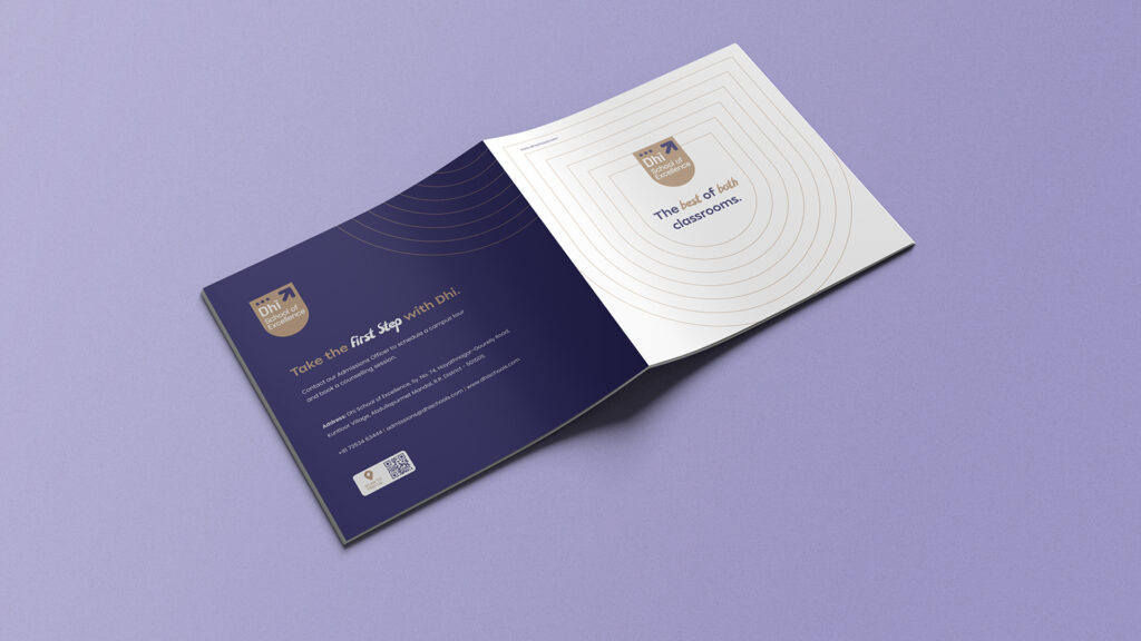
To bring the idea into everyday language, we created: Best of both classrooms.
A straightforward way to express the balance that the school aimed to deliver.
Designing the Identity
The identity was built around structure, progress, and aspiration.
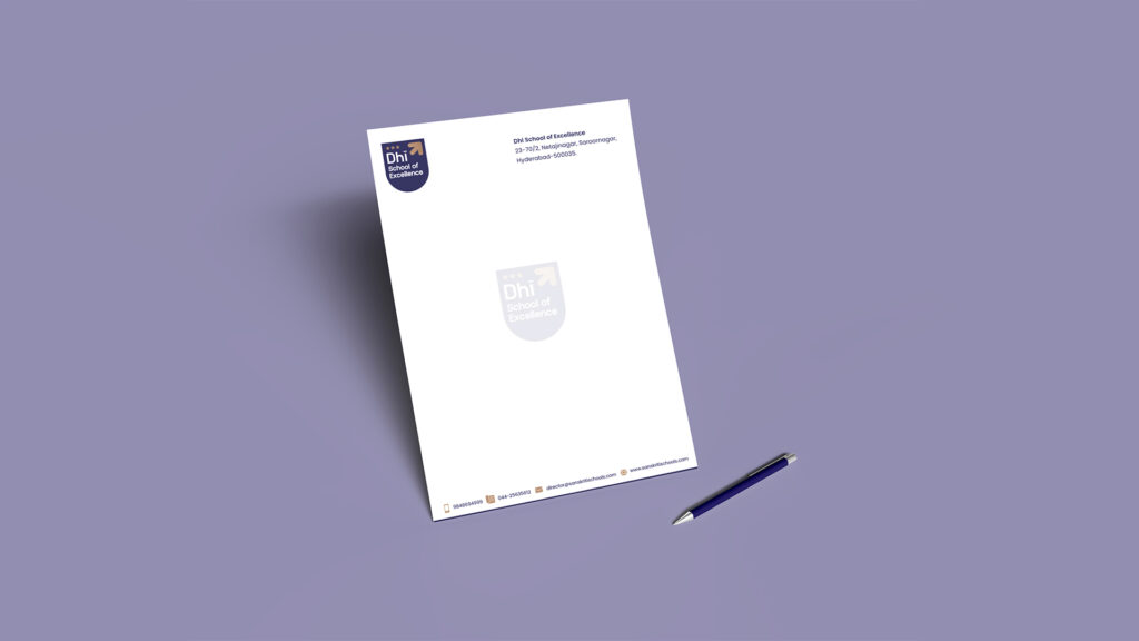
A bold shield anchors the logo, giving it a strong, institutional feel. Three stars at the top represent achievement, while a beige upward arrow in the corner signals growth and progress.
The typeface is clean and easy to read, working well across signage, communication, and digital use.
The Royal Blue adds a sense of trust and structure, balanced by a Camel Gold that keeps it approachable.
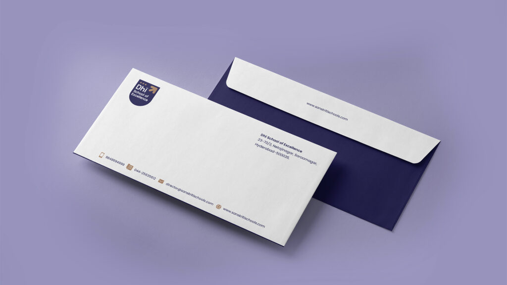
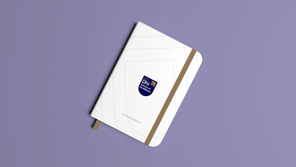
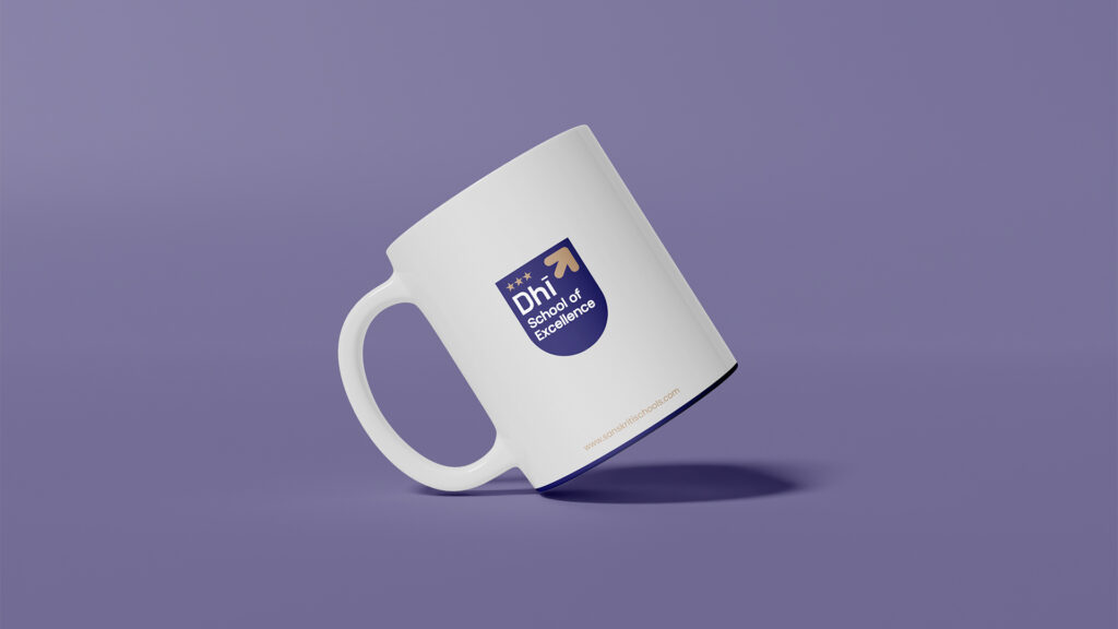
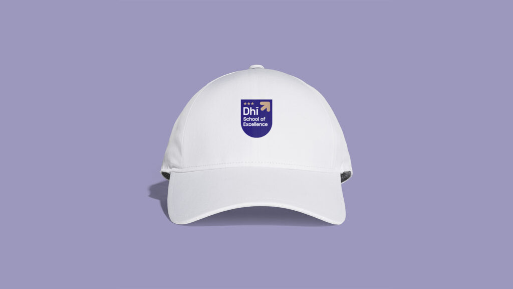
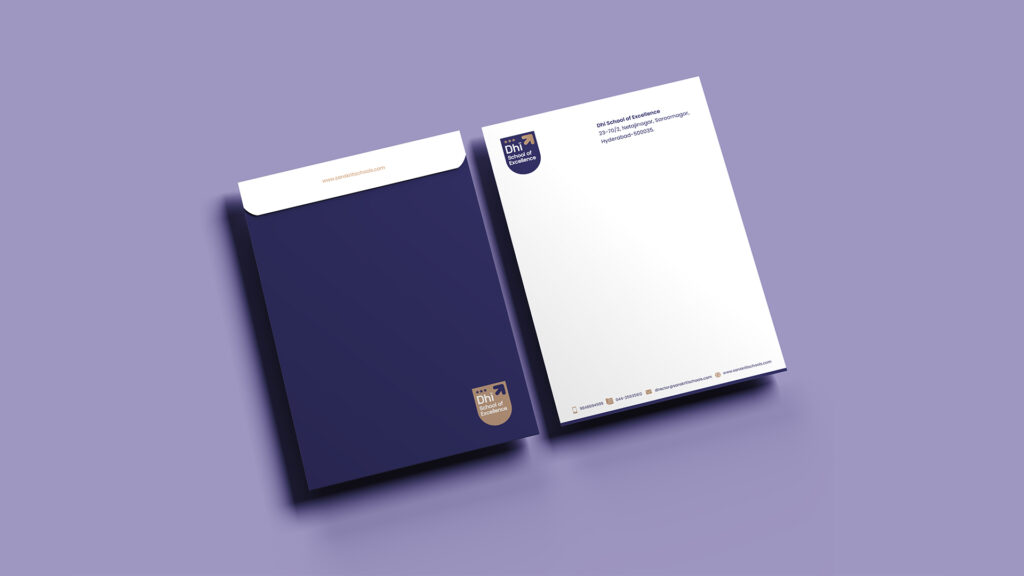
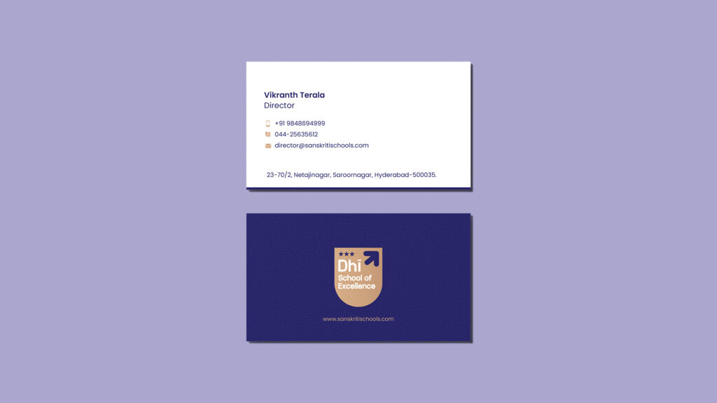
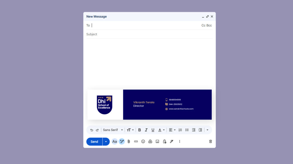
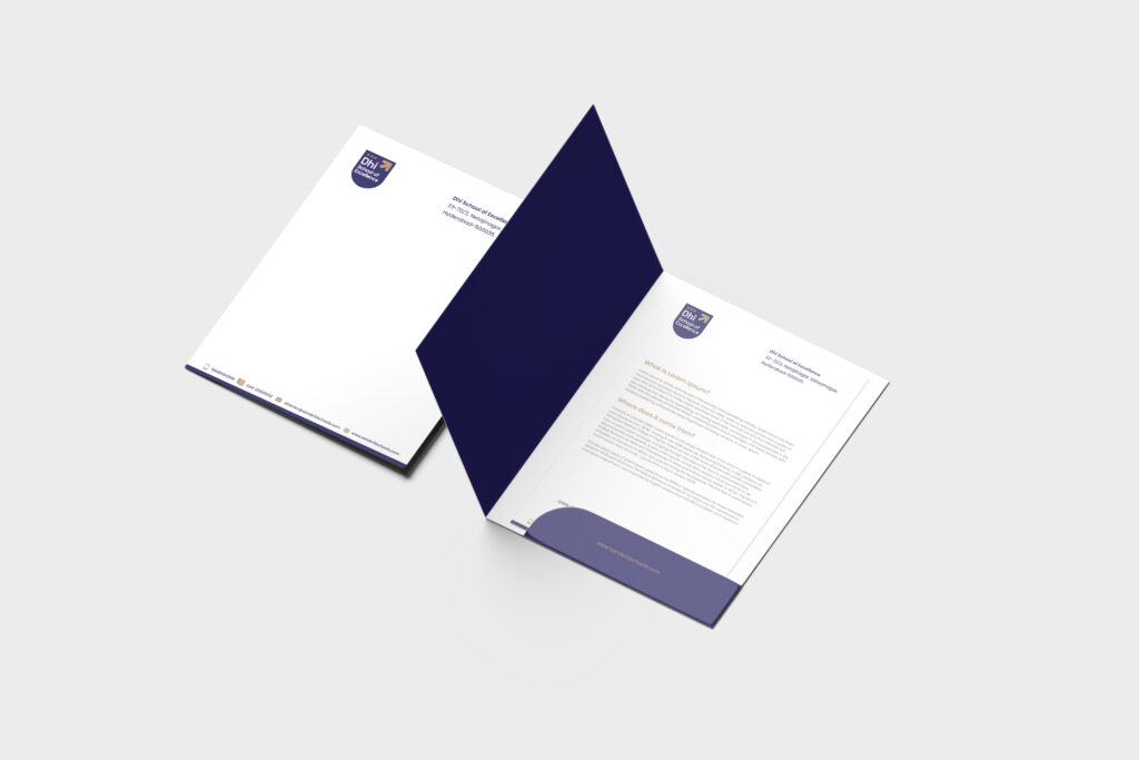
What We Built
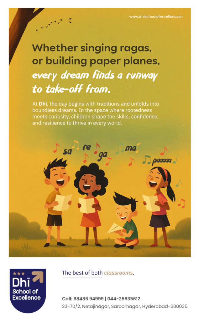
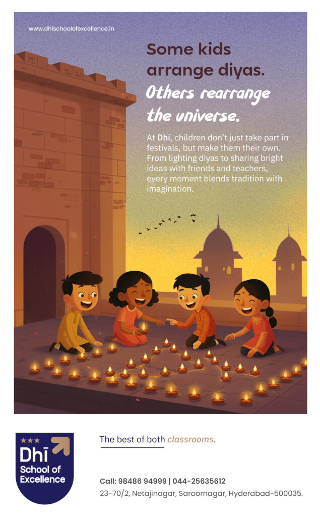
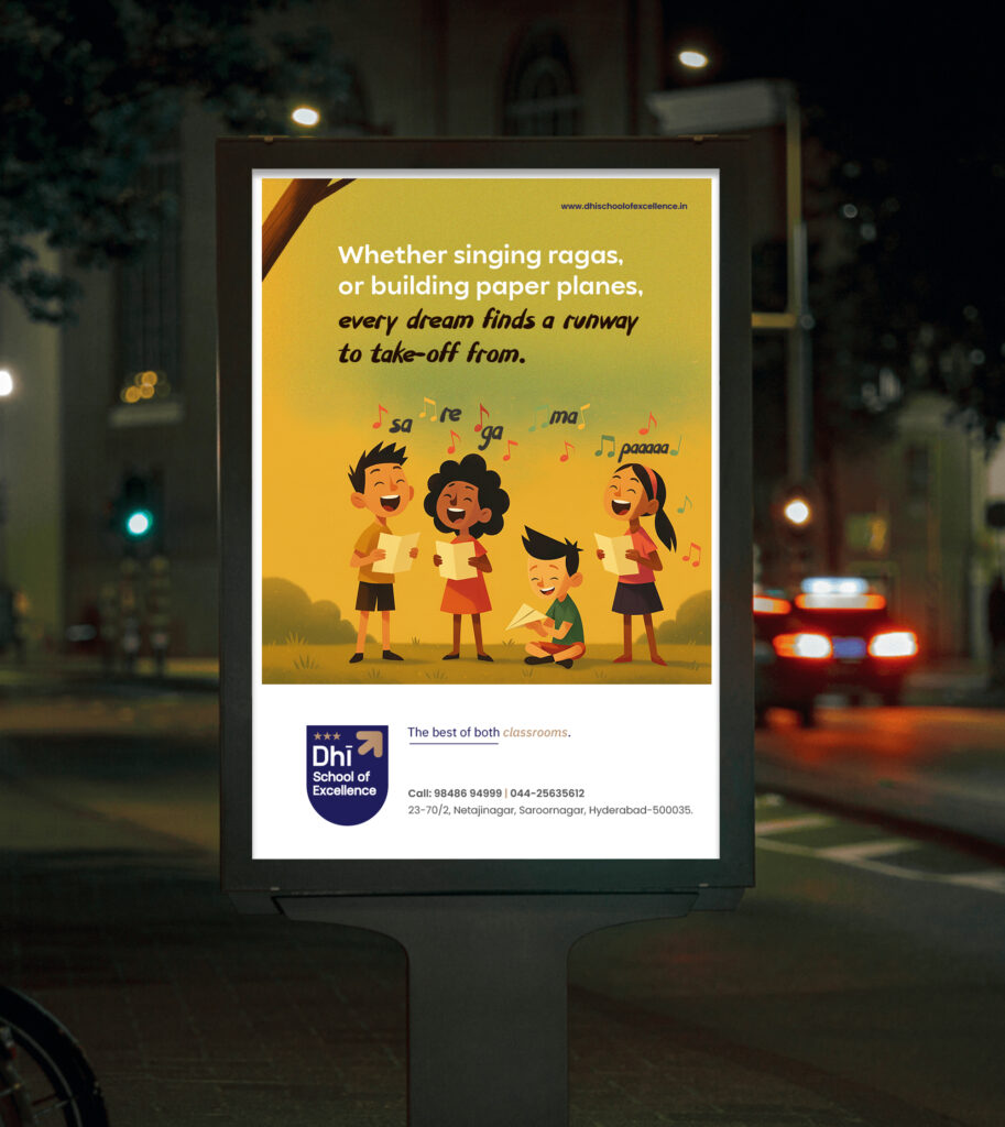
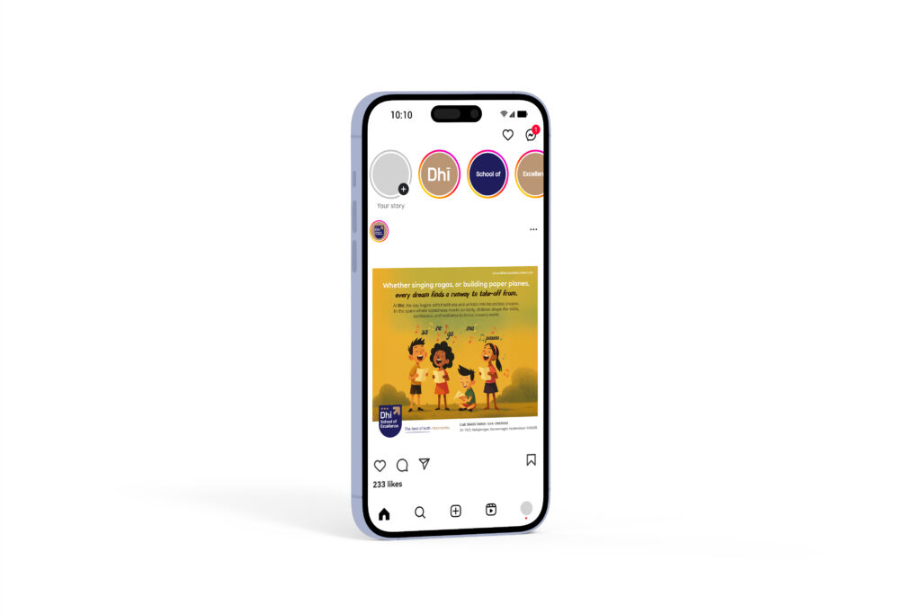
Beyond the logo, we developed the complete brand system. This included the overall branding, stationery, and supporting collaterals used across the school. Everything was designed to stay consistent, clear, and warmly-endearing to make day-to-day school communication a pleasant experience.
Bringing It Together
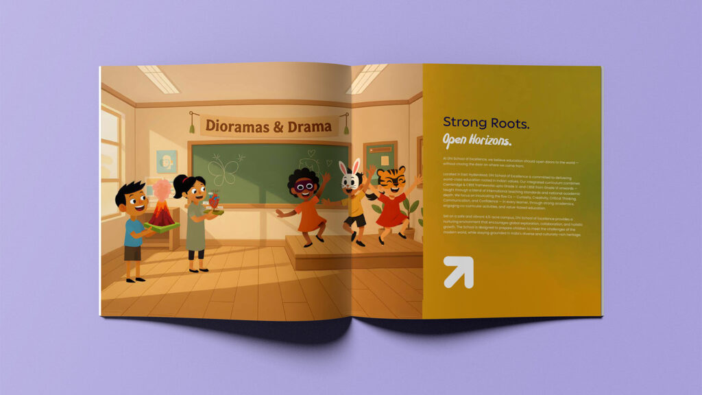
From the name to the identity to everyday applications, everything was built around a single idea — balance.
A brand that feels global in its outlook, but still rooted in its context.
Simple, consistent, and designed to grow with the school over time.